July 17, 2025
Beyond beautiful: Why IT Platform needs thoughtful website?” – ImLink case study

Today’s users are fundamentally different from those who visited websites in the early 2000s. While people once tolerated slow loading times and complex navigation, today they expect instant response and intuitive understanding. ImLink – all-in-one IT Platform for business communications – demonstrates how users should feel in the digital environment: confident, comfortable, and in full control of what’s happening. Its interface is built on atomic design principles, where components (buttons, cards, forms) are reused, ensuring style consistency and accelerating development, allowing for rapid content changes and staying relevant in a world of constant transformation. This sharply contrasts with the era of “waterfall” models, where design was “frozen” for months.
Frameworks and constraints: Discipline vs. Creativity
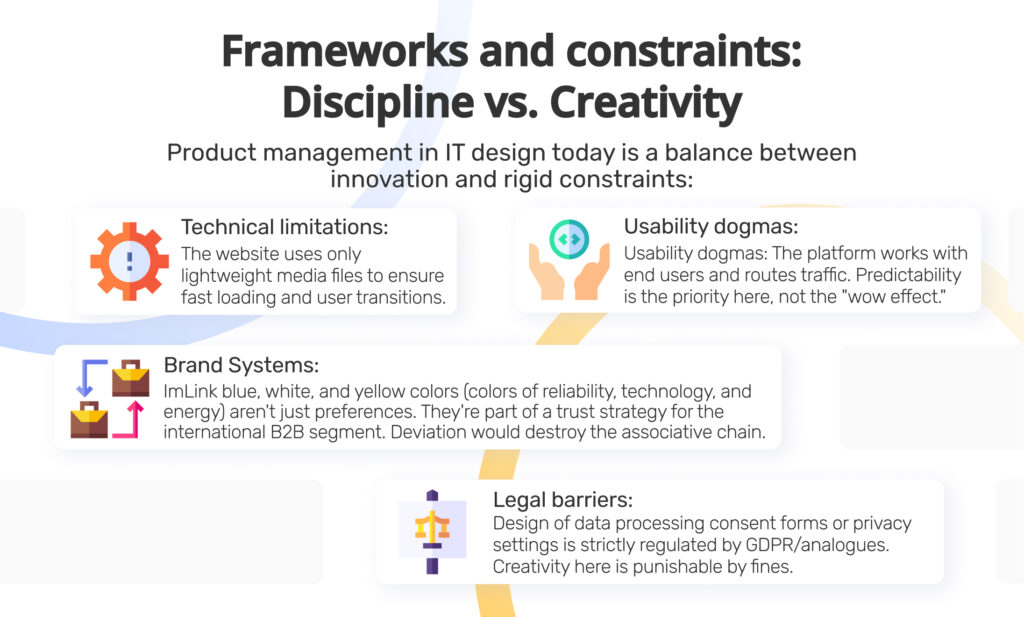
Product management in IT design today is a balance between innovation and rigid constraints:
- Technical limitations. The website uses only lightweight media files to ensure fast loading and user transitions.
- Usability dogmas. The platform works with corporate clients (end users and traffic routing). Experimental navigation patterns, common in consumer applications, are unacceptable here. Priority is predictability, not the “wow effect.”
- Brand systems. ImLink blue, white, and yellow colors (colors of reliability, technology, and energy) aren’t just preferences. They’re part of a trust strategy for the international B2B segment. Deviation would destroy the associative chain.
- Legal barriers. Design of data processing consent forms or privacy settings is strictly regulated by GDPR/analogues. Creativity here is punishable by fines.
What’s acceptable in 2025: Necessity vs. Taboo
Acceptable and necessary:
- Microinteractions. Smooth animation (without overdoing it), button animations, and smooth image appearances show user trust while not straining their browser.
- Accessibility of presentation. Clear yet professional and informative text makes information globally understandable.
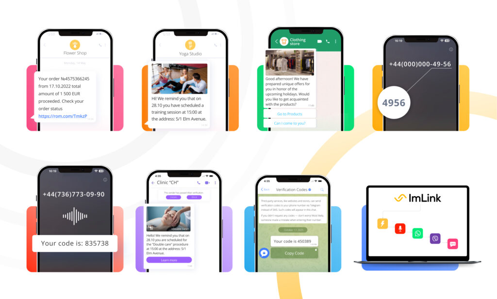
- Data as design material. Service visualization helps users understand how each channel or solution works.
- Accessibility (WCAG 2.2). Text contrast, semantic markup, screen reader support – ethically pleasant in all countries.
Strictly taboo:
- “Dark patterns.” Hidden subscriptions, complicated service cancellation. ImLink emphasizes transparency in its services and client interactions.
- Neglecting mobile-first. Up to 70% of website visits start from phones. Adaptability is basic.
- Aesthetics at the expense of function. Beautiful but unreadable font in statistics is a fatal error for B2B.
- Ignoring context. Bright red for an “Emergency call” button is appropriate, but not for the main CTA (Call to Action).
Visual as a tool for managing perception
- Color as emotional code
ImLink palette is a case study of color’s impact on product. The main colors remain blue, yellow, and white, forming a canvas for placing channels and products: from WhatsApp green to SMS pink.
- Human face of technology
Using images of real people in product presentations reduces the barrier between user and technology. People see themselves in these usage scenarios and make decisions more easily.
- Professional competence
Quality schemes and diagrams communicate expertise. Users understand they’re dealing with professionals who can visualize complex processes.
- Design as product language
ImLink isn’t just a “beautiful interface.” It’s a visual language that communicates platform values: reliability, simplicity, control. Every detail is aligned by the team according to modern trends in business communications.
The historical shift is that design stopped being “decoration.” It became a decision-making system. Frameworks aren’t enemies of creativity, but its foundation. They allow avoiding chaotic selection of design solutions and focusing on real user benefits and convenience. Modern toolstack (Figma, Jira, Hotjar) allows testing design hypotheses as quickly as code lines.
The main challenge today isn’t “how to draw” but “how to measure.” A successful product manager in IT design is one who understands how button color affects support conversion, how animation reduces errors, and how adaptive grid increases mobile user retention. ImLink, with its conciseness and focus on data-driven solutions, reflects this maturity. Design here isn’t art, but a precise tool for achieving business goals within the rigid framework of reality.